เอกสารงานแปลสรุปข่าว
แปล-สรุปบทความเรื่อง ที่1.
Shank T-shirt Design And Packaging (Student Project)
การออกแบบบรรจุภัณฑ์เสื้อยืดยี่ห้อ "แช๊งค์"(โครงการนักศึกษา)
เขียนโดย Derrick Lin
แปลสรุปความโดย นาย พลพัฒน์ นงค์นิ่ม
รหัสนักศึกษา 5111302328 กลุ่มเรียน 202
Contact E-mail : polrapat79@gmail.com
Contact E-mail : polrapat79@gmail.com
Publish Blog : http://artd3302-polrapat.blogspot.com
รายงานวิชา ARTD3302 การออกแบบกราฟิกสำหรับบรรจุภัณฑ์
 |
ที่มาของภาพ : http://1.bp.blogspot.com/-F8I1RIa1WpA/Ufn5EGB0MI/AAAAAAAA4HY/AhyY11S4Xk4/s1600/Shank+(1).jpg
.jpg)
ARTICLE (บทความ)
The brief was to create an entity of four-ness.
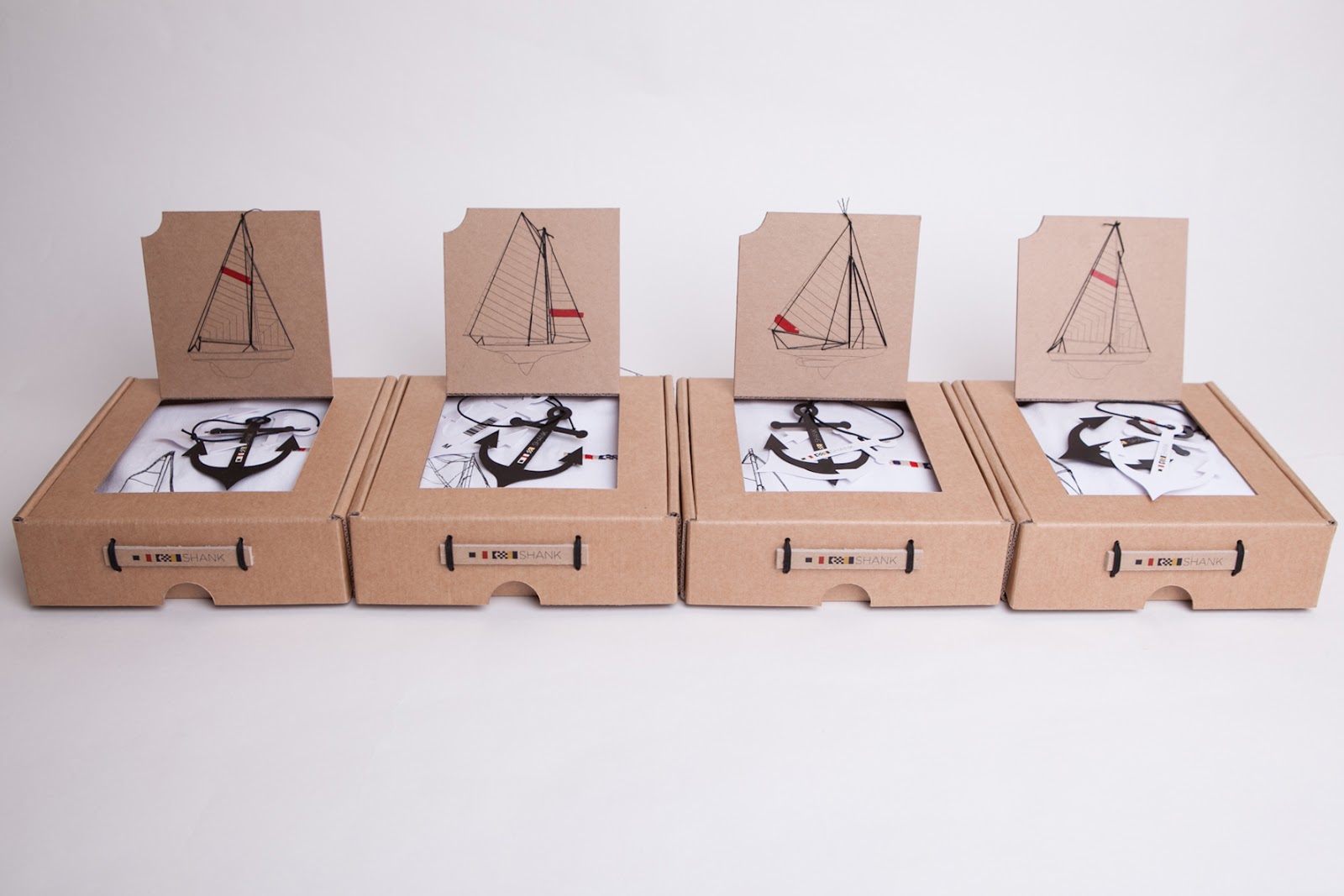
I chose to create a series of four t-shirt designs of classic sailing boats with an architectural line drawing style. Each t-shirt design was hand drawn and screen printed including a splash of red colour in each design stylized as though somebody had rolled paint onto the illustration.
The brand name 'Shank' was chosen as it relates to the nautical theme of the designs, a shank is the term used for the center rode of an anchor, each t-shirt is branded with the Shank logo on the left chest panel. The logo is made up of the maritime signal alphabet to spell out Shank.
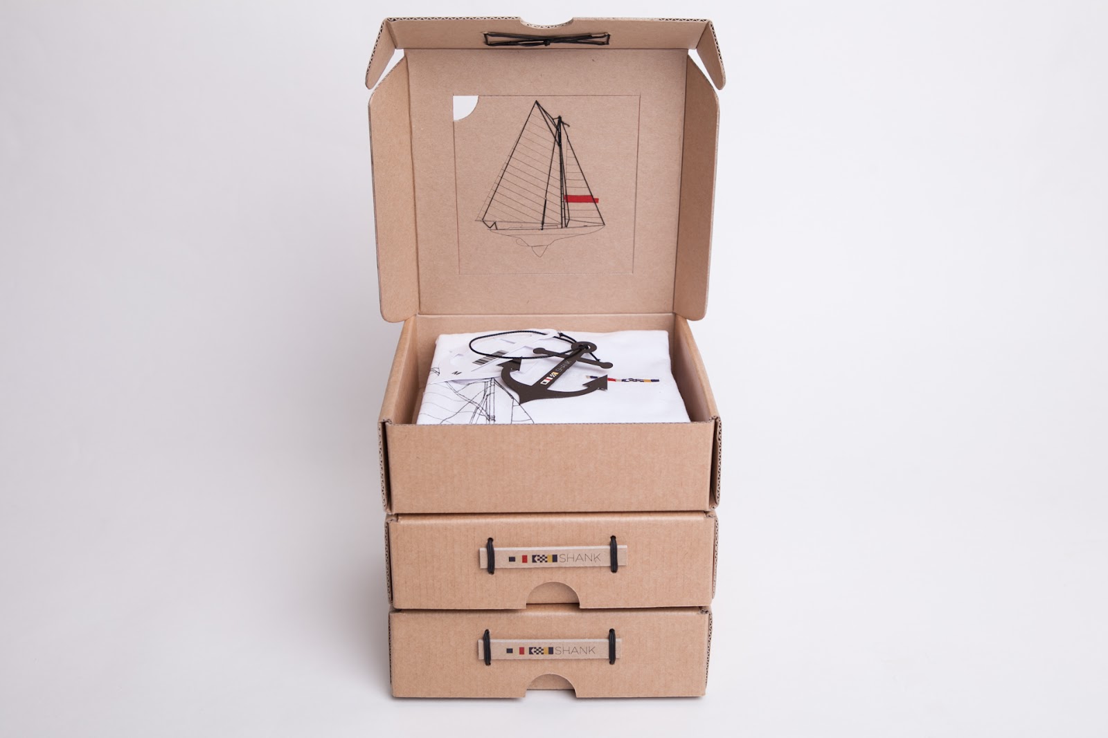
The packaging design of the boxes includes a scaled version of each boat illustration relating to the product inside, these each have hand stitched rigging. The idea behind the box logo was to recreate a Plaque like what would be found on a sailing ship or dock. Tied to the boxes and knotted with reef knots inside.
The final touch is the Anchor shaped swing tags which include the Shank logo running down the center bar.
แปลข่าว
สั้น ๆคือการสร้าง องค์กร ของ โฟว์ เนส
ฉันเลือกที่จะ สร้างชุดของ สี่ การออกแบบ เสื้อยืดของเรือแล่น เรือใบ คลาสสิกกับสไตล์ การวาดเส้น สถาปัตยกรรม แต่ละ การออกแบบเสื้อยืดถูกดึงมือ และหน้าจอ พิมพ์ รวมทั้งการสาดของสีแดง ในการออกแบบ เฉพาะตัว แต่ละลายราวกับว่า มีใครบางคน กลิ้ง สี ลงบน ภาพ
' Shank ' ชื่อแบรนด์ได้รับการแต่งตั้ง เป็นที่เกี่ยวกับชุดรูปแบบ ของการออกแบบ ทะเลขาวเป็นคำที่ใช้ สำหรับศูนย์ ขี่ม้า ของ สมอแต่ละตัว เสื้อยืด เป็น ตราสินค้า ที่มีโลโก้ Shankบนแผง หน้าอก ด้านซ้าย โลโก้ถูกสร้างขึ้นจาก ตัวอักษร สัญญาณการเดินเรือ ที่จะสะกด ออก Shank
ออกแบบบรรจุภัณฑ์ของกล่องรวมถึงรุ่น ปรับขนาด ของ ภาพ เรือแต่ละลำ ที่เกี่ยวข้องกับ ในผลิตภัณฑ์เหล่านี้ แต่ละคนมี มือ เย็บ เสื้อผ้า คิดที่อยู่เบื้องหลัง โลโก้ กล่องคือการ สร้าง โล่ เหมือนสิ่งที่ จะพบ บนเรือ ล่องเรือหรือ ท่าเรือ ผูกติดอยู่กับ กล่องและ ผูกปม ที่มี ปม ในแนวปะการัง ภายใน
สัมผัสสุดท้าย คือ แท็ก แกว่ง Anchor รูป ซึ่งรวมถึง โลโก้ Shankวิ่งลงไปที่ บาร์ ศูนย์
 |
.jpg)
 |
ที่มาของภาพ : http://3.bp.blogspot.com/voIGRnZerIs/Ufn5F1et8gI/AAAAAAAA4H4/bU7tlRJy88k/s1600/Shank+(6).jpg
.jpg)
แปล-สรุปบทความเรื่อง ที่2.
McDonald's Happy Meal (Concept)
บรรจุภัณฑ์ ชุด ความสุขของอาหารกับแมคโดนัล (คอนเซปป์)
เขียนโดย Derrick Lin
แปลสรุปความโดย นาย พลพัฒน์ นงค์นิ่ม
รหัสนักศึกษา 5111302328 กลุ่มเรียน 202
Contact E-mail : polrapat79@gmail.com
Contact E-mail : polrapat79@gmail.com
Publish Blog : http://artd3302-polrapat.blogspot.com
รายงานวิชา ARTD3302 การออกแบบกราฟิกสำหรับบรรจุภัณฑ์
 |
ARTICLE (บทความ)
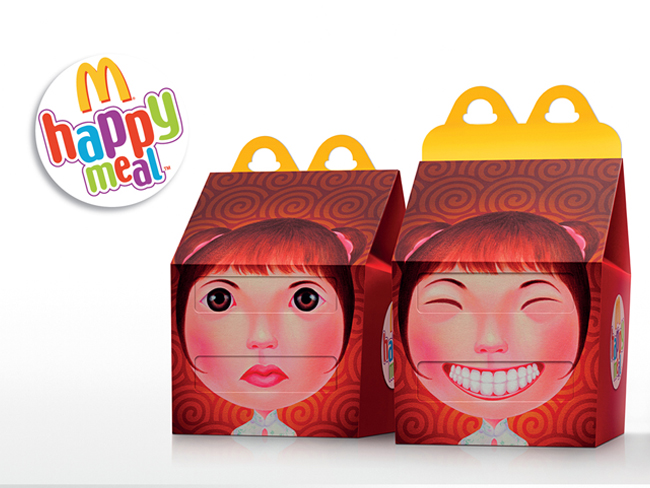
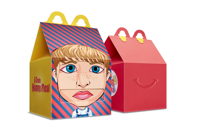
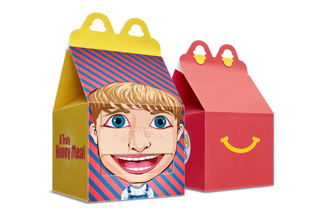
This project is a packaging design, designed for a competition for Mcdonald's Happy Meal that we recently submitted. The designs consist of Thai cultures which we combined with Happy Meal theme to create a series of new Happy Meal design packaging and illustrations.
แปลข่าว
โครงการนี้คือการออกแบบบรรจุภัณฑ์ที่ออกแบบมาสำหรับการแข่งขันสำหรับการรับประทานอาหารมีความสุข Mcdonald ที่เราเพิ่งส่ง การออกแบบประกอบด้วยของวัฒนธรรมไทยที่เราทำงานร่วมกันกับรูปแบบอาหารมีความสุขในการสร้างชุดใหม่ของการออกแบบบรรจุภัณฑ์อาหารมีความสุขและภาพประกอบ
 |
ที่มาของภาพ : http://2.bp.blogspot.com/Ya_WdC2it4Q/T9cLFxJrn_I/AAAAAAAAXEY/okF3mi3vO0w/s1600/happymeals+%281%29.jpg
 |
 |
แปล-สรุปบทความเรื่อง ที่3.
Wodka Wanessa
บรรจุภัณฑ์ว๊อดก้า ของ เวเนซซ่า
เขียนโดย Derrick Lin
จาก : http://www.packagingoftheworld.com/2013/03/wodka-wanessa.html
แปลสรุปความโดย นาย พลพัฒน์ นงค์นิ่ม
รหัสนักศึกษา 5111302328 กลุ่มเรียน 202
Contact E-mail : polrapat79@gmail.com
Contact E-mail : polrapat79@gmail.com
Publish Blog : http://artd3302-polrapat.blogspot.com
รายงานวิชา ARTD3302 การออกแบบกราฟิกสำหรับบรรจุภัณฑ์
 |
ที่มาของภาพ : https://blogger.googleusercontent.com/img/b/R29vZ2xl/AVvXsEgxzjzO0NOvUcgHR2IHuyA-hGfBIL_qsGd7_EKX5ZlurV3lm4AMlE-RGzCen9PcqxzXyZAZsVefcV0gAFISUyLDPdyLlfgkrDWMQfoDCUUpg6Co_ruIulgLMYZVdL0J_a9pbCxIqbq_03E7/s640/wodlawanessa-potw+%25281%2529.jpg
Illustrations by Olivia Gürtler
ARTICLE (บทความ)
100% Austrian grain vodka with taste!
Vanessa Gürtler, founder of Wodka Wanessa, is graduate of University of Gastronomic Sciences (UNISG) in Bra. Alois Gölles distills 3 varieties for Wodka Wanessa - Spelt, Corn and Rye.
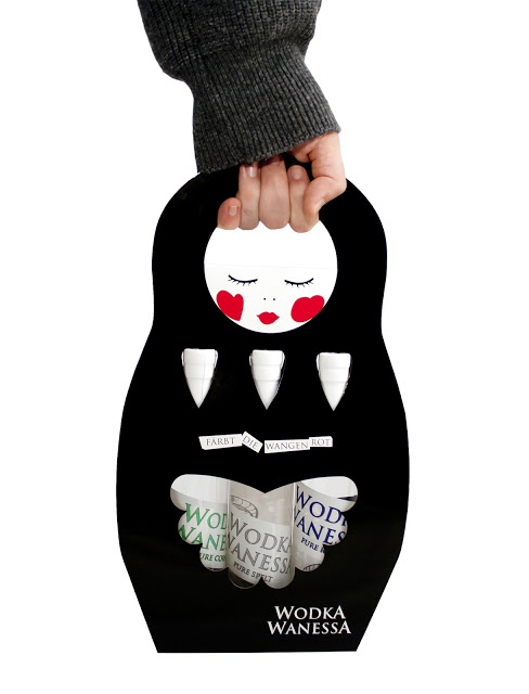
Wodka Wanessa is a handmade Slow Food Product, so the packaging design has to tell the same. The bottles are labelled with duct tape by hand - every bottle is unique. For a set of the 3 tastes the focus was on creating a box with a high shelf-impact. Designed was a type of handbag in the shape of a Matryoshka which contains one 0,2l bottle of each sort. Easy to carry and stable. We choose the shape of a russian doll, because vodka is often associated with its origin (Russia/Poland).
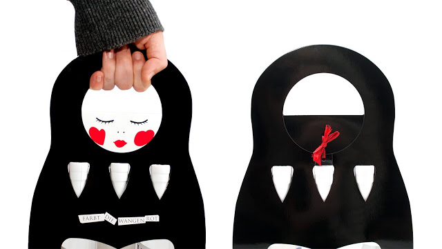
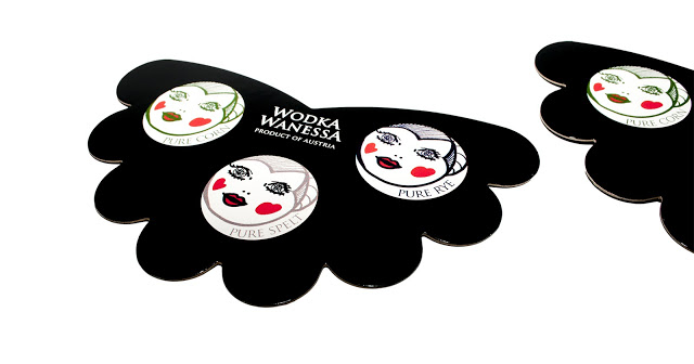
The cardboard box is lovely and witty and the space-saving cut is eco-friendly. It's easy to assemble without adhesive – a ribbon as closure emphasises the handmade vodka production. Purity of this vodka is shown with two-sided window faces. The punched-out window faces are reused as tasting sheets - nothing is wasted.
แปลข่าว
ว๊อดก้า ออสเตรียเมล็ดพันธ์พืชที่มีรสชาติ 100%
เวเนสซ่า กัตเลอร์ ผู้ก่อตั้ง ว๊อดก้า เวเนสซ่า เป็นบัณฑิตของมหาวิทยาลัยวิทยาศาสตร์การอาหาร ตั้งอยู่ชั้นในของเมืองในภูมิภาคตะวันตกเฉียงเหนือในประเทศอิตาลี วอดก้า เวเนสซ่า ผลิตโดยการนำชนิดข้าว 3 พันธ์มาเป็นตัวกลั่น คือ ข้าวสาลี ข้าวโพด และข้าวไร
ว๊อดก้า เวเนสซ่า เป็นผลผลิตที่ทำด้วยมือมาเป็นอาหารที่มีความประณีต และให้คุณค่าทางโภชนาการสูงและดีต่อสุขภาพ ดังนั้นในการออกแบบบรรจุภัณฑ์จึงบอกไว้เช่นกัน ขวดจะถูกกำกับไว้โดยเทปพันสายไฟด้วยมือ ทุกขวดจะไม่ซ้ำกัน สำหรับชุดของว๊อดก้า 3 รสชาติจะถูกโฟกัสไปที่การสร้างกล่องที่มีการเก็บรักษาและระวังเรื่องผลกระทบค่อนข้างสูง ได้รับการออกแบบมาเป็นชนิดของกระเป๋าถือในรูปตุ๊กตา ซึ่งมีประเภทละ 1 ขวดจาก 3 ขวดอยู่ในนั้นง่ายต่อการพกพา ทางเวเนสซ่าเลือกรูปร่างของตุ๊กตารัสเซียเพราะว๊อดก้าเกี่ยวข้องกับต้นกำเนิดของรัสเซีย
กล่องกระดาษที่เป็นที่น่ารัก มีไหวพริบ และการตัดกระดาษที่ประหยัดพื้นที่เป็นมิตรกับสิ่งแวดล้อมง่ายต่อการประกอบโดยไม่ต้องใช้กาว มีริบบิ้นในการรผูกปิดไว้ เน้นการผลิตว๊อดก้าที่ทำด้วยมือ ความบริสุทธิ์ของว๊อดก้านี้จะแสดงให้เห็นด้วยใบหน้าสองด้านประกบติดกัน และเป็นหูหิ้วแบบไม่มีอะไรที่จะเสียหาย
 |
 |
ไม่มีความคิดเห็น:
แสดงความคิดเห็น